I was telling Andrina I created a league where I was a star. Being a kid super interested in drawing, geography and sports logos I created names and logos for all my teams. I called my league the ACSL, which I think I just picked at first because I liked the sound of the letters. Anyway, the acronym came to stand for the "Associated Cities Sporting League," giving it kind of an old-fashioned sounding historical connotation (as if it was contemporary to, or even pre-dated the NHL.) But ACSL teams also had a football component too, because I liked to draw football players in the autumn. Some teams had full rosters, and a lot of them had jerseys, and I even drew a few stadiums, because my dad was an Architect and I liked to draw buildings.
 I decided I would try and recreate all the logos and post them, mostly for my amusement, but also for anyone who is interested in what a creative but nerdy kid I was. These first three are all from the state of Ohio. I think the Ohio Bullets one was the first one I ever drew, long before I'd thought of a league. It was just something I doodled once and then kept doodling because I liked it. I think they might have been based in Toledo (like Klinger from M.A.S.H.) but I'm not sure.
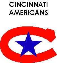
  TheCincinnati Americans are one of two teams that were called "Americans," the other one being from Arizona. I'm not positive why I did this, but the CFL had two "Rough Riders" so it seemed appropriate. I remember the American's logo being a bit of an ironic rip-off of the Montreal Canadien's (one of my all time favourites) so that's how I've reproduced it.
  Clevland's logo is super simple, another one that just came about by drawing circles. Clevland was always one of my favourite American cities. I always like the Browns and Bernie Kosar, even though they could never get by the Bengals or Broncos. Clevland, like Winnipeg, is a blue-collar town with an artistic heart. We're not cosmopolitan or effete, we're meat and potatoes towns that suffered long from mediocre sports teams. We're both substantial cities in our respective countries, but not anywhere near the top of anyone's list of important ones.

3 comments:
Rye guy,
The logo for the Ohio Bullets has to be the best Freudian manifestation of pubescent lust I have ever seen. The only thing that could make it more symbolic might be if you inserted a tiny bottle of Astroglide in the corner of the frame.
Fantastic, my friend.
Cheers,
The Saucerman
Wait till you see the Boston Beavers.
LOL! That's exactly what I thought...
Post a Comment